Casual But Classy
The Phoenix Cavern is a brand created to fill a niche of Southwestern food for an upper middle class audience. The target audience would likely be working parents who would want to bring their families somewhere nice as a treat without breaking the bank. The challenge is to create visual material and environments that reflect these ideals and speak to the values of the target audience.
Constructing the Vision
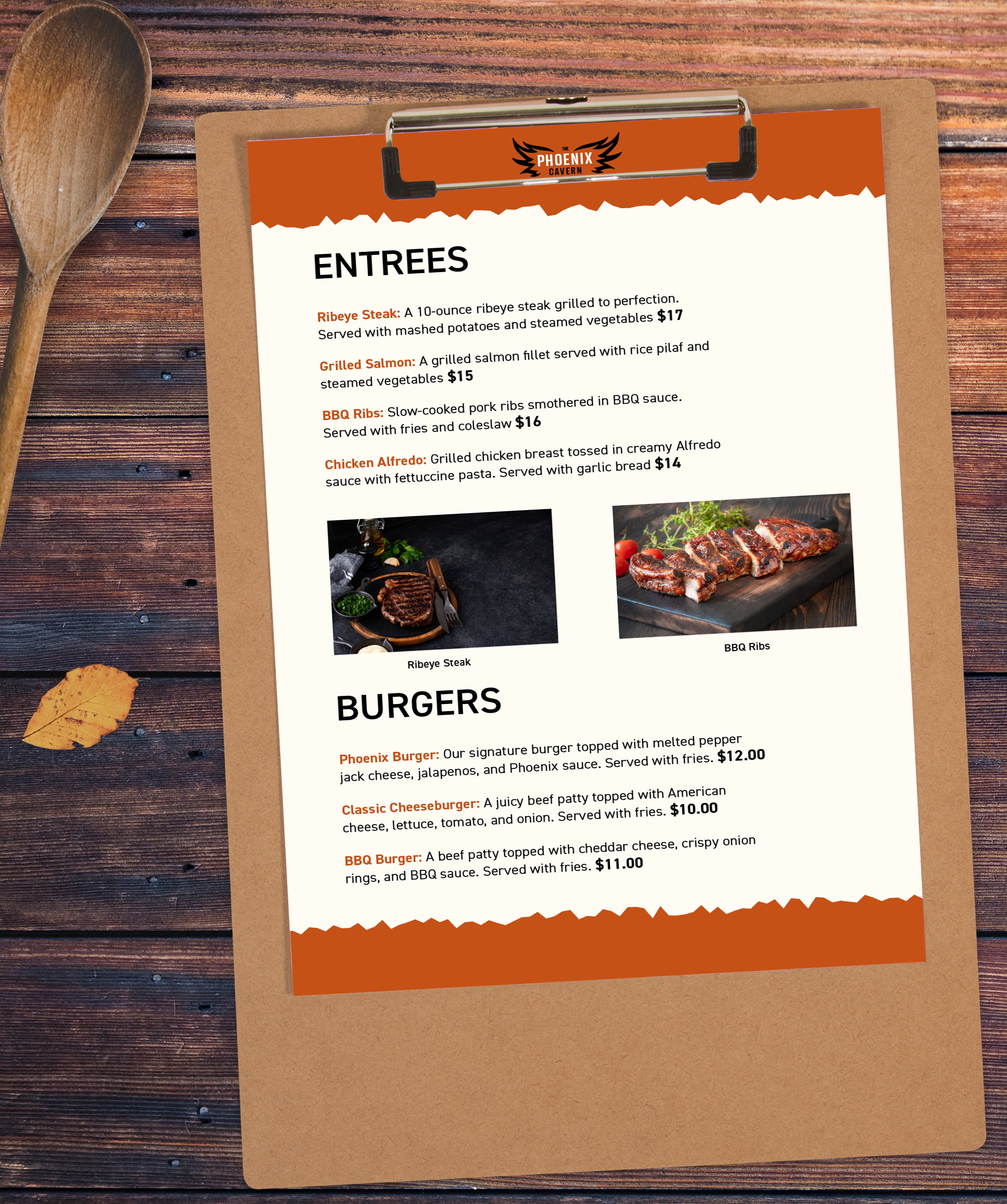
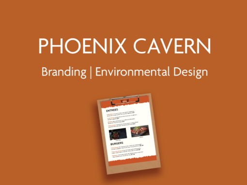
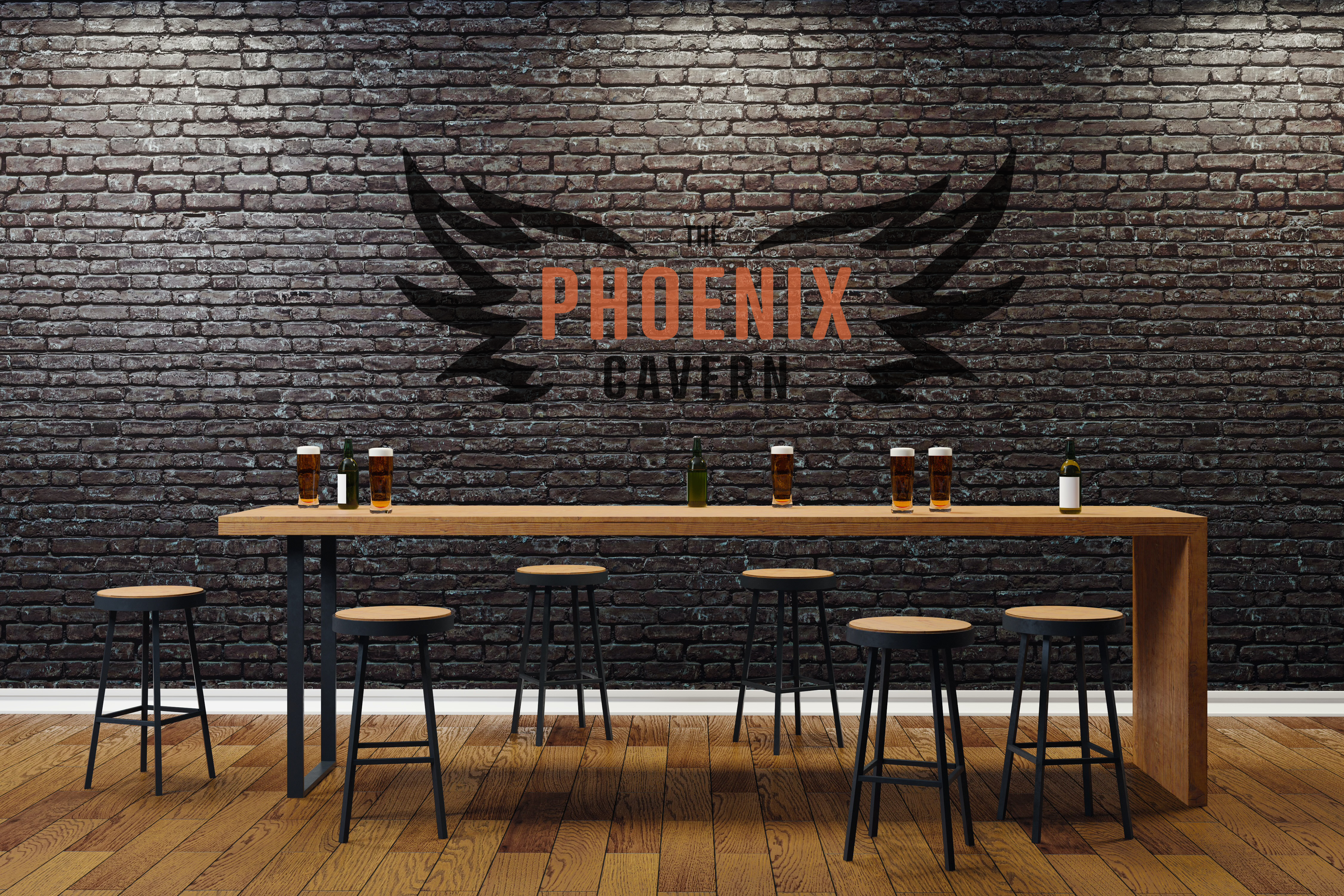
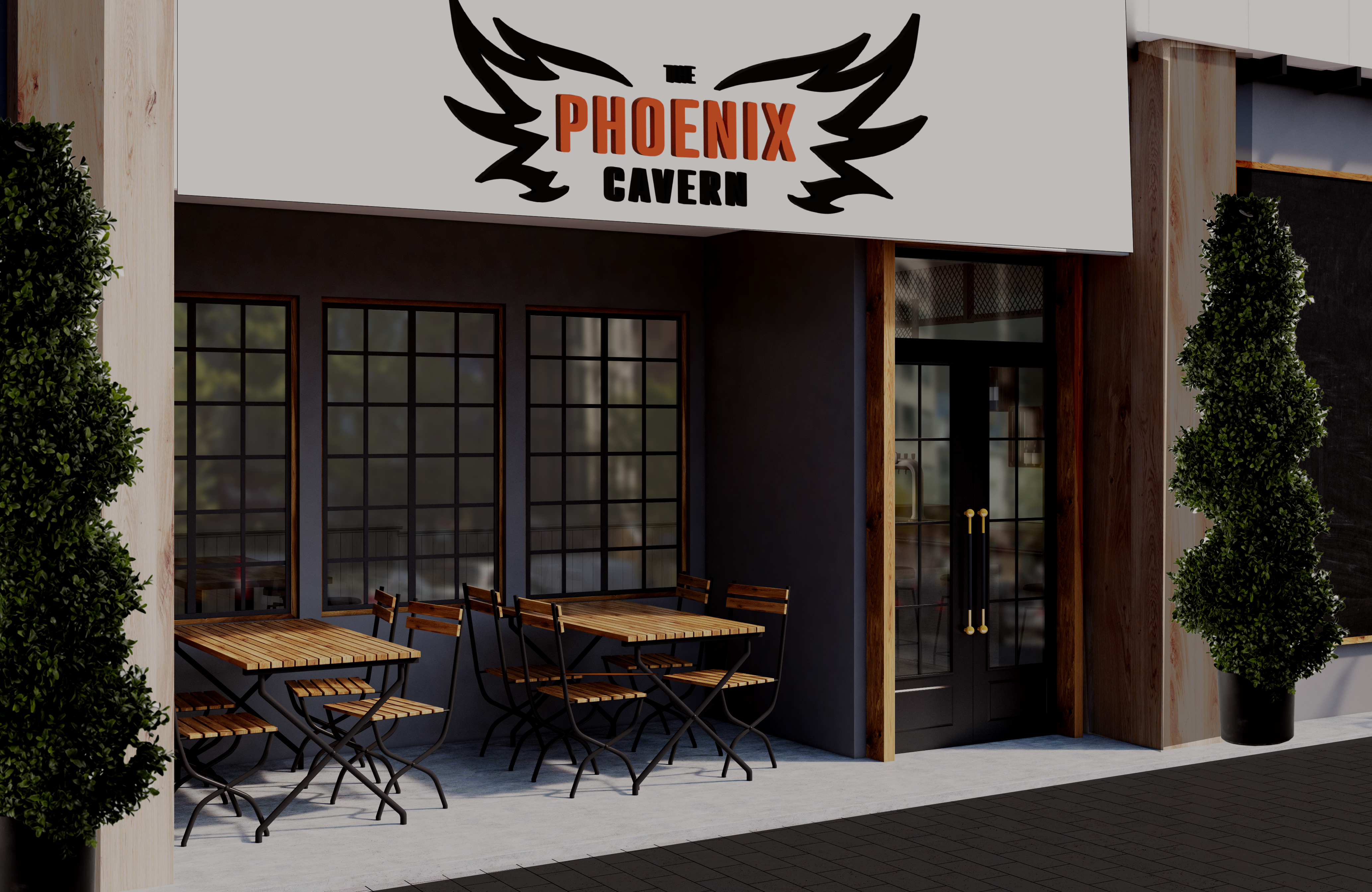
The development of this project began with discovering a color pallet that will make the viewer enticed to come in and try the food. Something warm like orange seems to conjure ideas of grilling and flames, as well as being on brand with the Phoenix theme. The wings and type are meant to balance each other, placing the emphasis on the Phoenix portion of the logo. Warm colors and wooden textures are featured throughout material for the restaurant and the building itself. This keeps emphasis on the fire-forward motif for the brand. The website features warm, vibrant images that make the customer hungry even upon viewing.
Set Your Tastebuds on Fire!
The design solution to this challenge resulted in a mid to upper class dining experience which is fun for the whole family. The warm orange and black color palette inspires thoughts of flames, and even better, flame-grilled steaks and burgers. These colors are incorporated throughout the brand, ranging from the brick and mortar establishment all the way to the website. Combining rustic, modern, and a little bit casual, the Phoenix Cavern is an inviting place to eat whenever you are craving something delicious.
