Elevating Event Experiences
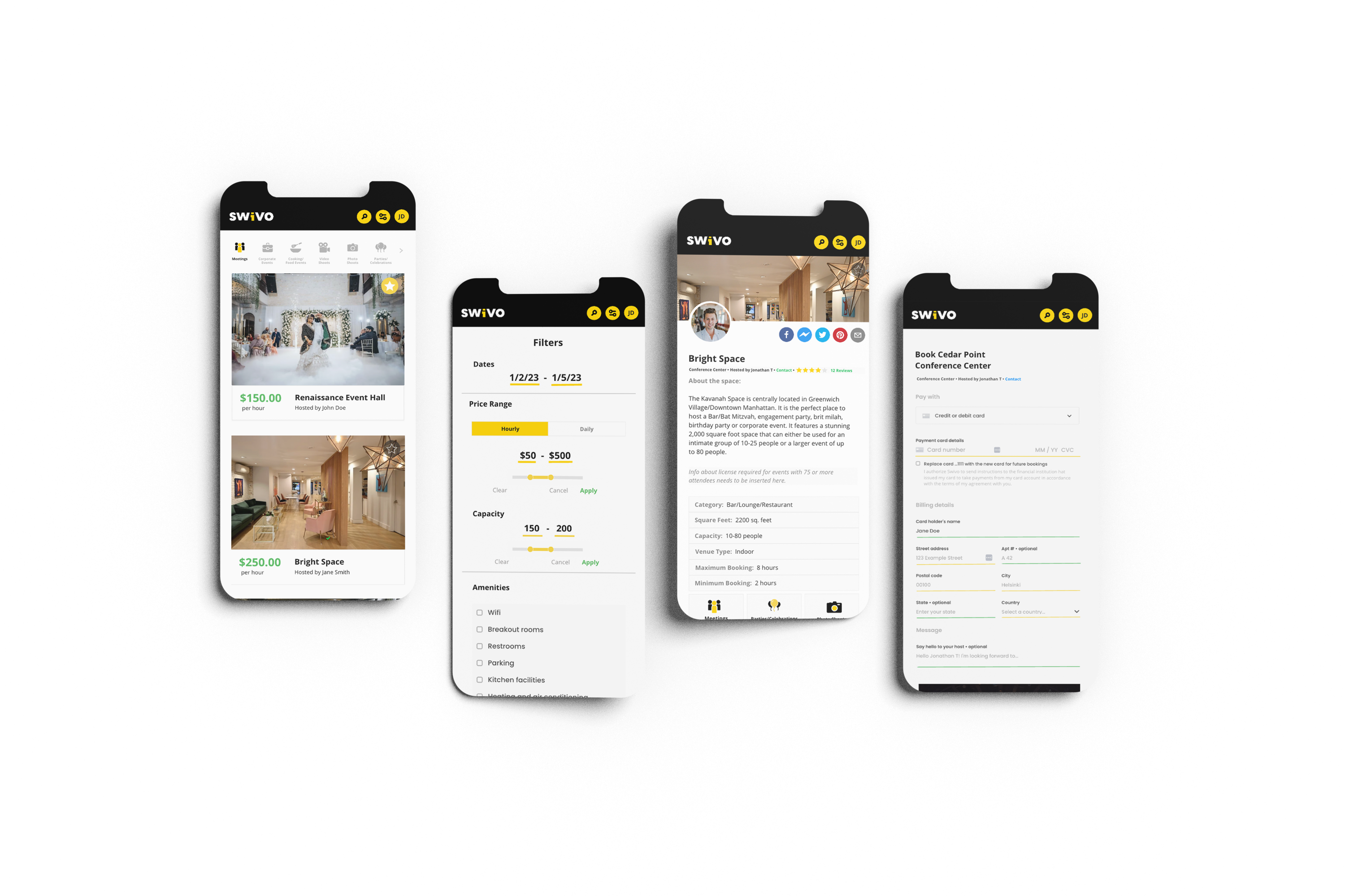
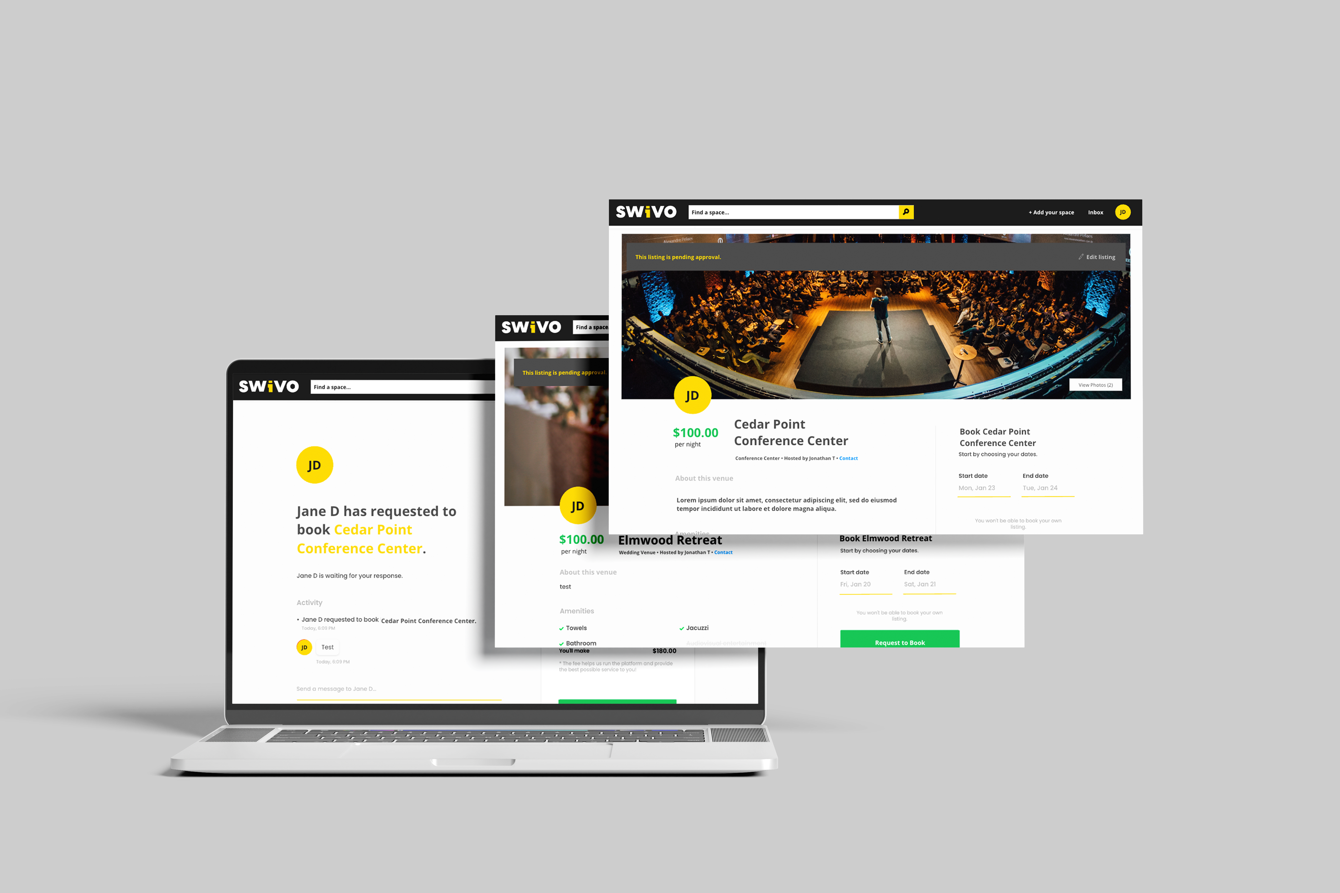
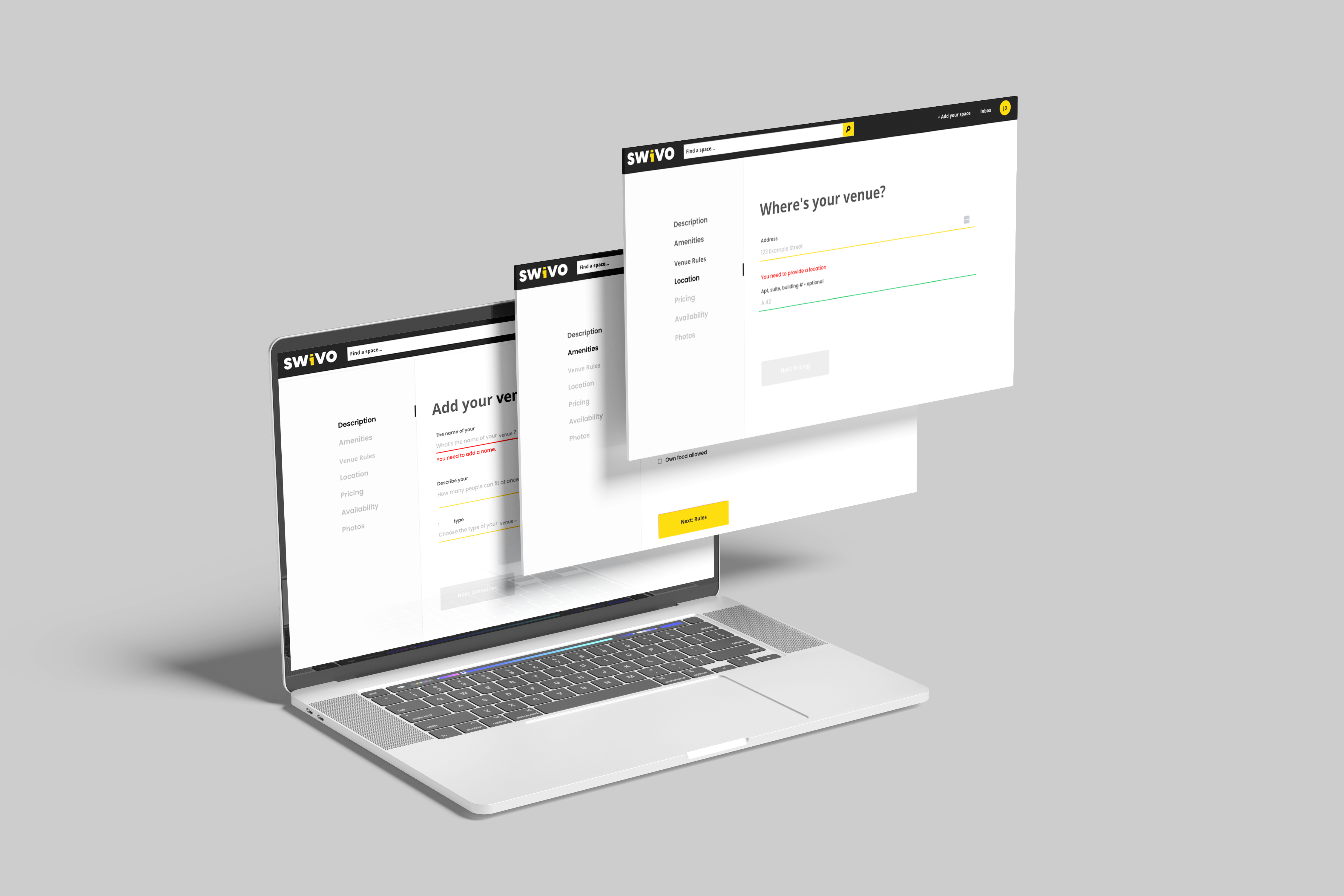
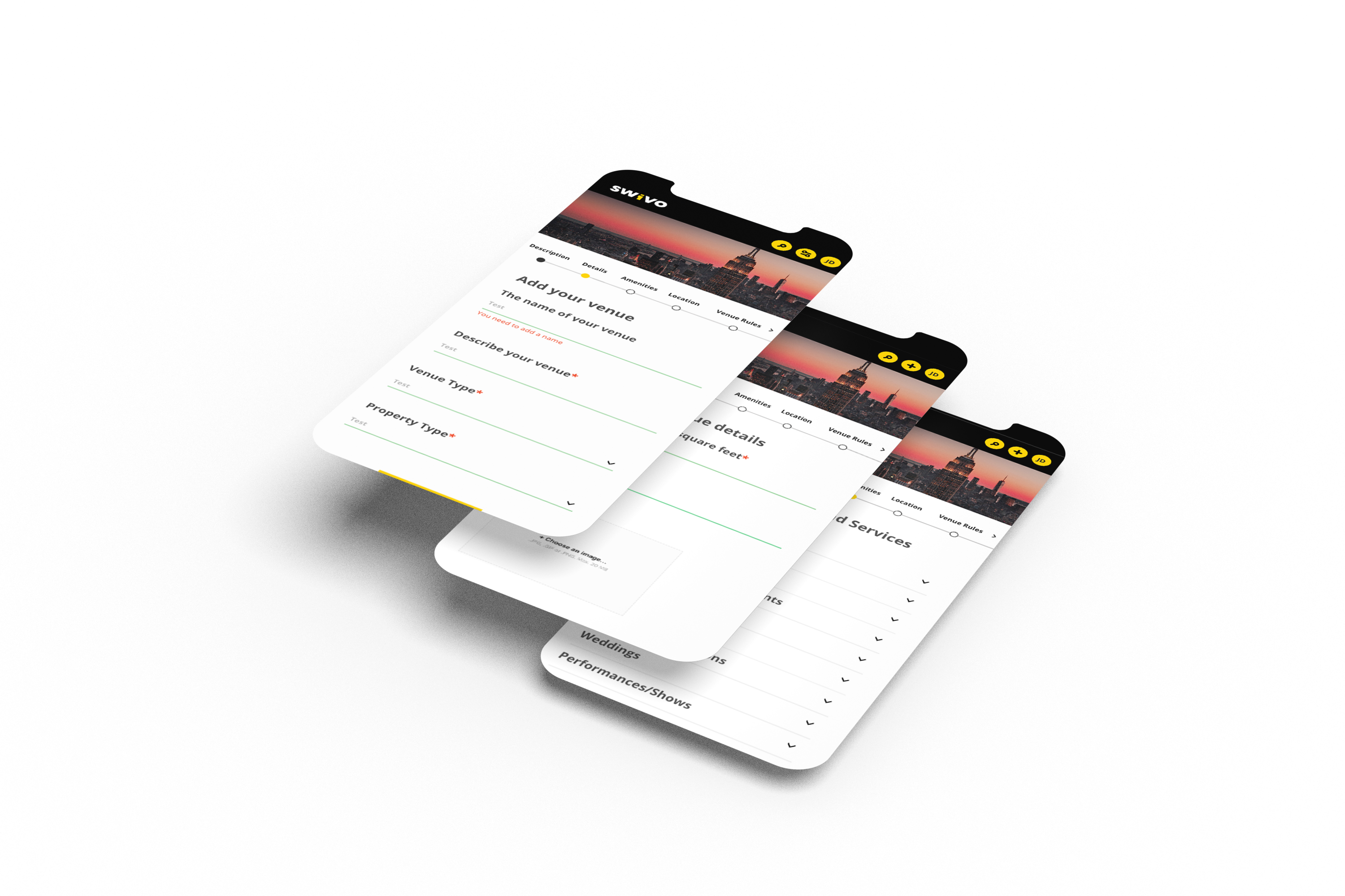
My adventure with Swivo began during my internship with Dark Square where we worked to redefine how New Yorkers discover and reserve event spaces. The challenge was clear: to infuse every screen with a visual language that captures the city’s vibrancy and the essence of each unique venue. From sleek, mobile-friendly layouts to responsive desktop interfaces, I embarked on a journey of adaptive design. It was about making Swivo accessible to everyone, ensuring that the beauty of New York’s events could be experienced anywhere, on any device.
Crafting Identity
In the sea of digital experiences, Swivo had to stand out. That’s where my passion for branding took center stage. I meticulously curated the company’s colors, perfected the type hierarchy, and ensured every detail aligned with Swivo’s distinct identity. The result was a visual symphony that resonates with the heart of New York. Each screen radiated the city’s bold and vibrant energy, inviting users to embark on their event-planning journey with confidence and excitement.
Seamless Experiences
Designing a use experience is more than just aesthetics; it’s about facilitating meaningful interactions. To make Swivo user-friendly, I implemented innovative features like price point sliders and interactive tables throughout different parts of the browsing process. These tools empowered customers to effortlessly explore, compare, and secure their dream event spaces, turning their visions into reality.
