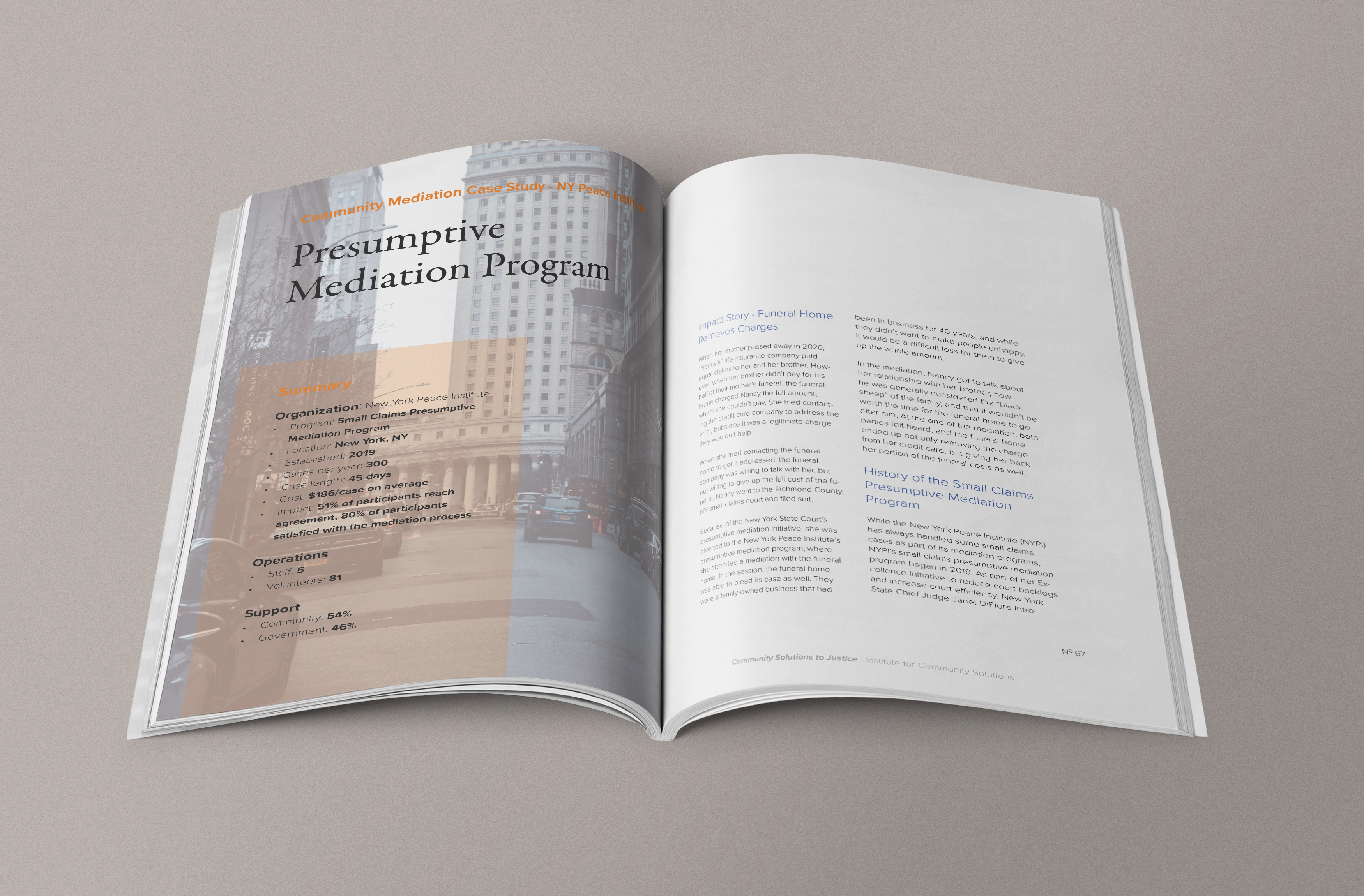
Designing in Harmony
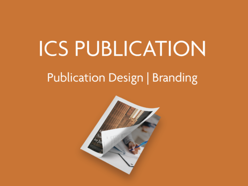
Right from the start of the project, I embraced the Institute for Community Solutions’ brand guidelines, weaving their distinctive fonts, colors, and specifications into the fabric of the report. Every element I crafted was a testament to their identity, ensuring visual cohesion and a seamless representation of their mission. Selecting the right imagery is often the bridge between words and emotions. With “Community Solutions to Justice,” I scoured for images that resonated with the report’s message, creating a visual narrative that evoked empathy, urgency, and hope. Every image carefully chosen to amplify the impact of the content.
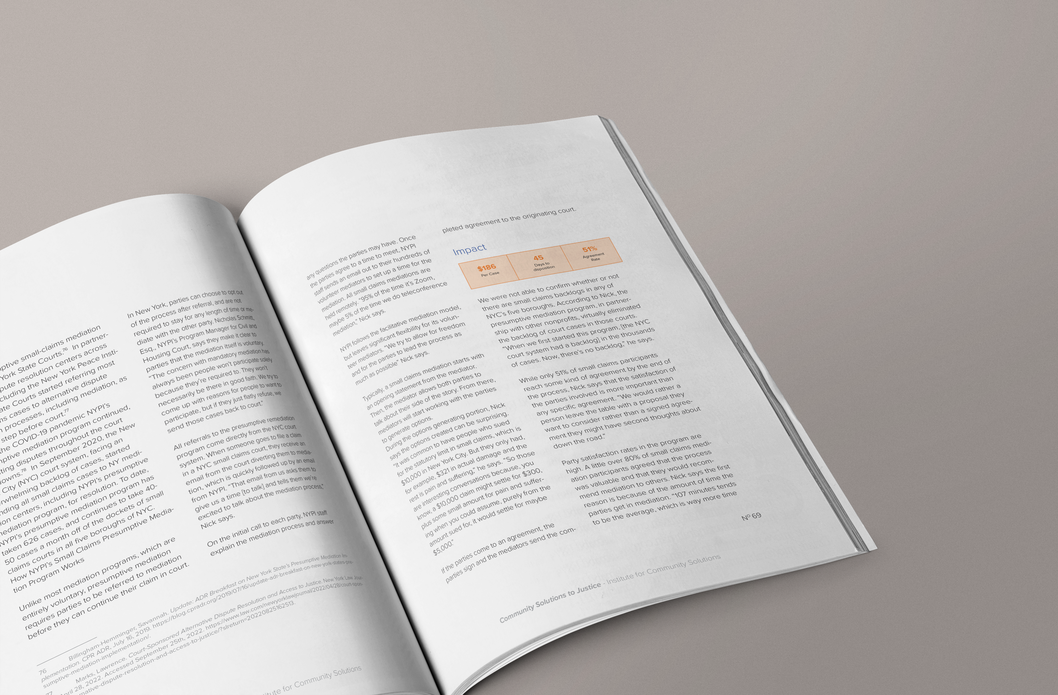
Data Visualization
One of the most compelling aspects of this project was the opportunity to distill complex information into visually engaging elements. I meticulously designed infographics, charts, and other materials that breathed life into statistics and research findings. My aim was to make the topics in the book as clear and digestible as possible, empowering readers to grasp the gravity of the issues at hand.

Amplifying the Message
This project wasn’t just about designing a report; it was about amplifying a message. “Community Solutions to Justice” unveils a transformative approach to the justice system, and I was honored to be a part of it. Through the design, I aimed to capture the essence of community-driven justice solutions, from the speed of case processing to the elevated perceptions of fairness. As the pages turned, I knew the report held the potential to bring faster, fairer, and better justice to communities across the United States. It was a privilege to contribute to this comprehensive report, introducing readers to five community solutions to justice, sharing case studies, and providing valuable resources. In every design choice I made, I endeavored to bring this vital information to life, inspiring change and sparking conversations. “Community Solutions to Justice” isn’t just a report; it’s a catalyst for transformation.
